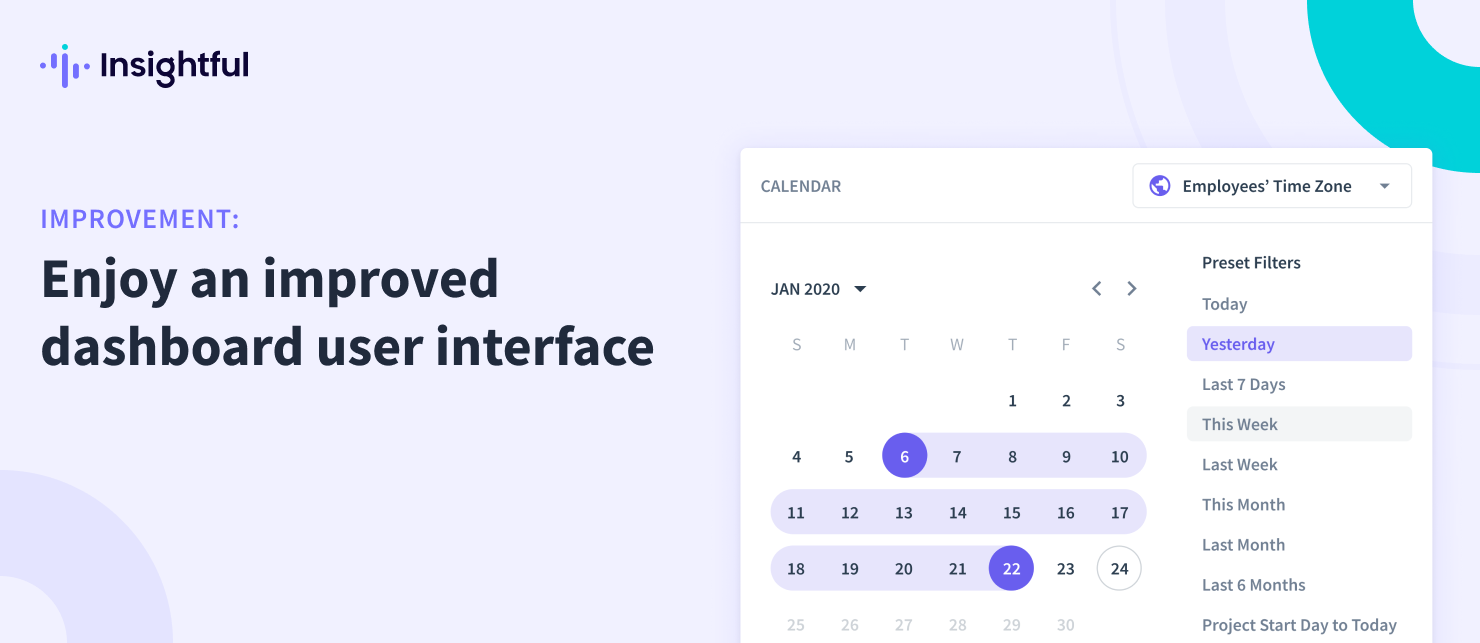
Experience a Better User Interface with Our Revamped Dashboard
We've taken steps to improve your experience using the dashboard and make it easier to navigate. We've made several changes, including: Redesigning the calendar button for better usability, including the ability to select your time zone; Adding a "New Employee" button to the Real-Time Insights page; Unifying the User Management CTA button for admins, managers, and clients; Redesigning various CTA buttons to improve user experience; Improving the search box functionality and various filters; Adding on-hover tooltips to explain features on the productivity overview; Using sticky elements to keep the app header in place while users scroll; Moving trial period information to a new banner at the top of the screen.